Work > Uber

Navigating the dynamic landscape of ride-sharing can be a challenge, with demand fluctuating unpredictably throughout the day.
Navigating the dynamic landscape of ride-sharing can be a challenge, with demand fluctuating unpredictably throughout the day.
Navigating the dynamic landscape of ride-sharing can be a challenge, with demand fluctuating unpredictably throughout the day.
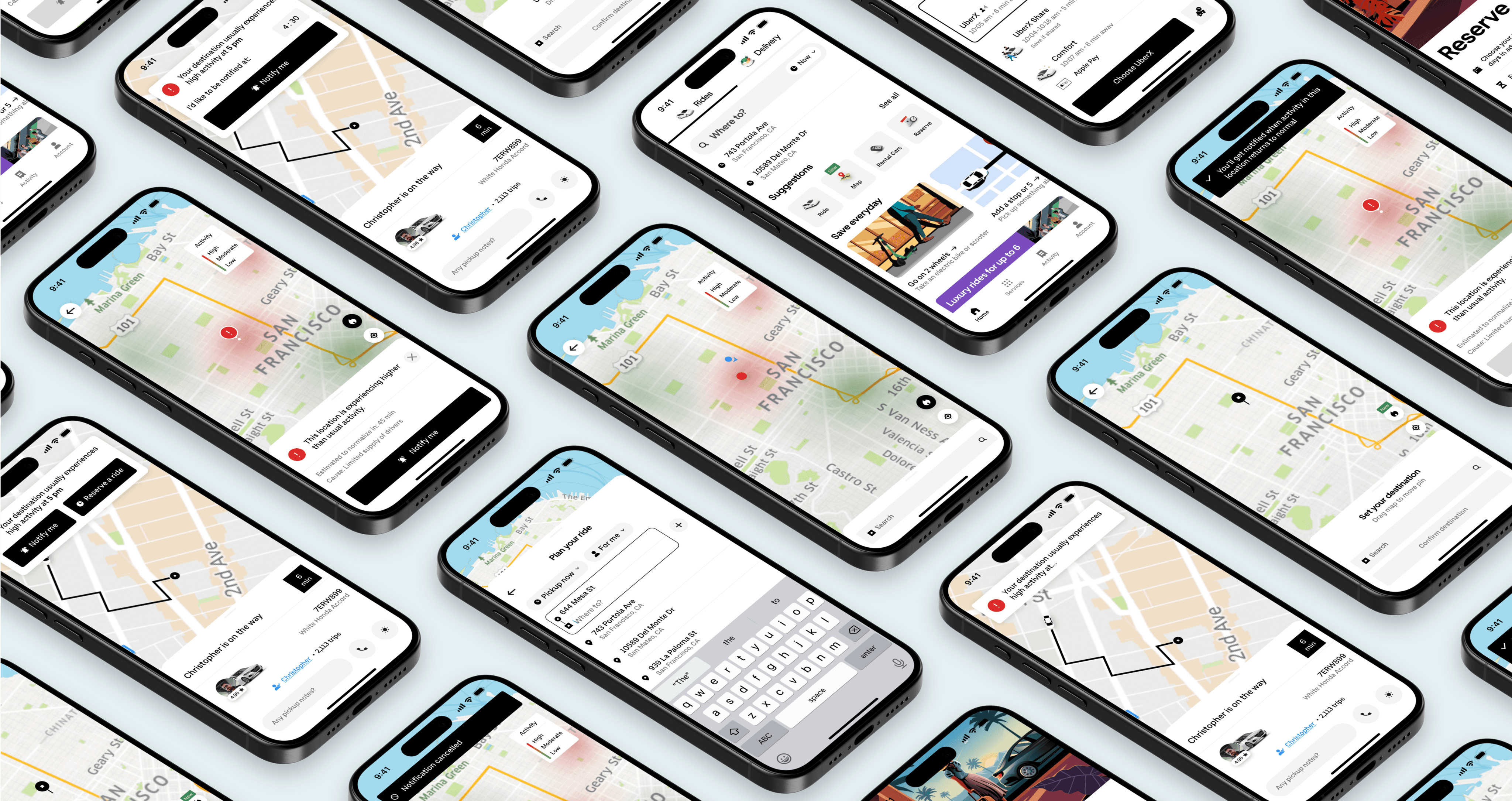
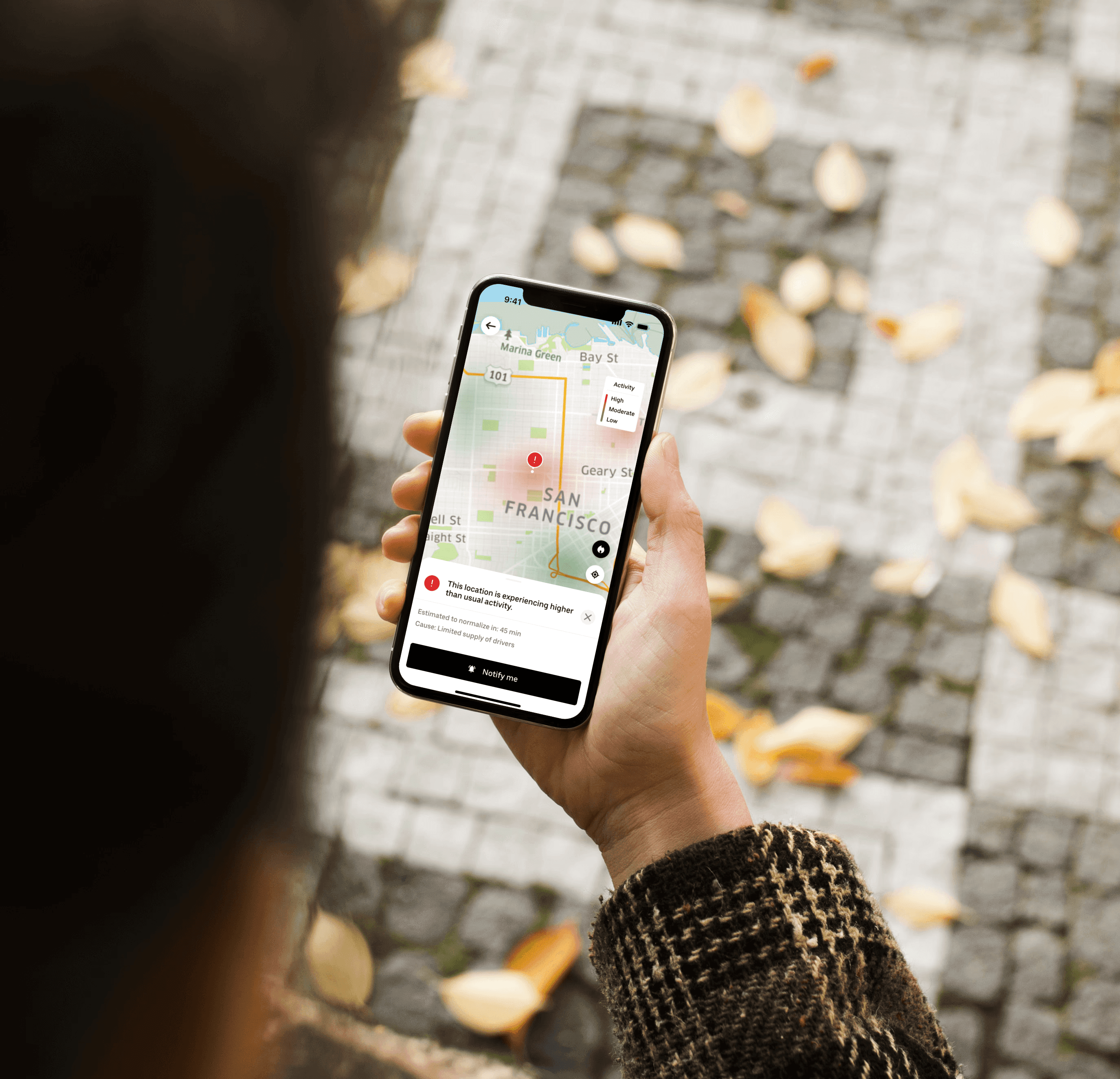
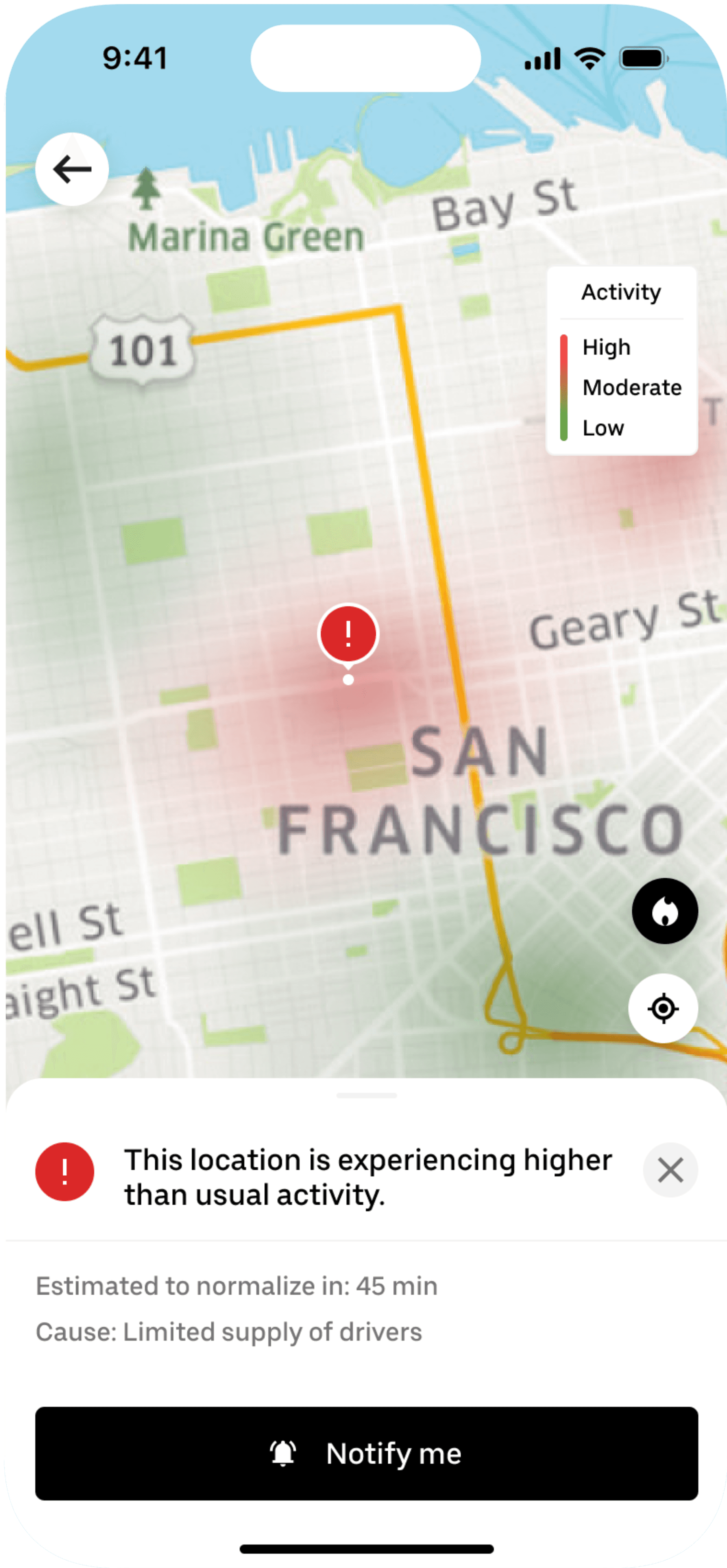
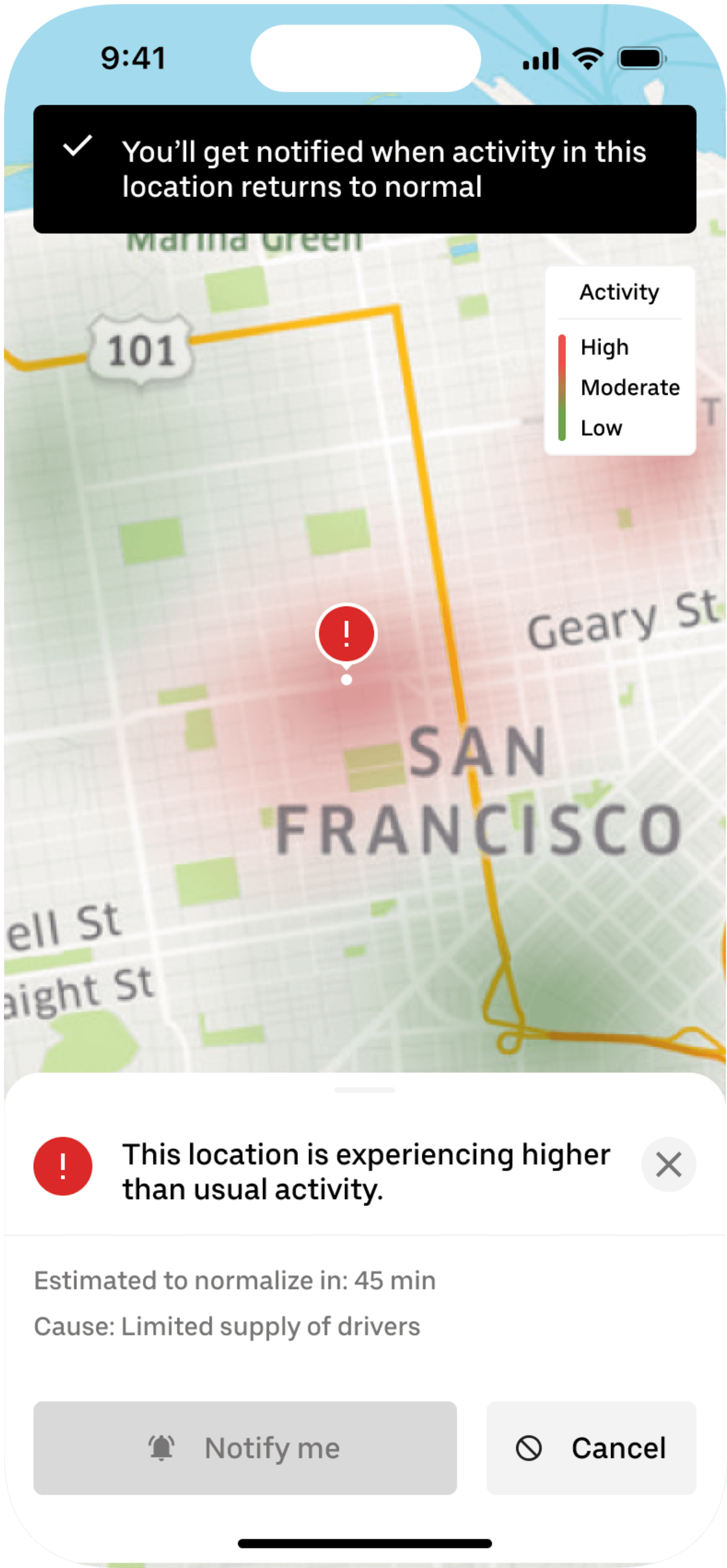
To empower Uber users, I designed a Heat Map feature that provides real-time visibility into areas experiencing heightened activity levels. This tool not only highlights surge zones but also delves deeper—explaining why these areas are experiencing increased demand and offering the option to notify users when activity returns to normal.
To empower Uber users, I designed a Heat Map feature that provides real-time visibility into areas experiencing heightened activity levels. This tool not only highlights surge zones but also delves deeper—explaining why these areas are experiencing increased demand and offering the option to notify users when activity returns to normal.
To empower Uber users, I designed a Heat Map feature that provides real-time visibility into areas experiencing heightened activity levels. This tool not only highlights surge zones but also delves deeper—explaining why these areas are experiencing increased demand and offering the option to notify users when activity returns to normal.
Duration
Duration
4 weeks
4 weeks
Role
Role
User Research, Information Architecture, Wireframing, Interface Design, Prototyping, Usability Testing
User Research, Information Architecture, Wireframing, Interface Design, Prototyping, Usability Testing
Tools
Tools
Figma, Zoom, Adobe Photoshop, Dovetail, Google Suite
Figma, Zoom, Adobe Photoshop, Dovetail, Google Suite
Project Overview
Project Overview
Project Overview
Problem
Problem
Many Uber users experience frustration and dissatisfaction when faced with significantly higher fares during peak times, also known as surge pricing.
Many Uber users experience frustration and dissatisfaction when faced with significantly higher fares during peak times, also known as surge pricing.
The unpredictability of surge pricing can catch users off guard, leading to reluctancy to book rides when prices spike. This can especially affect cost-conscious riders, and cause them to seek alternative transportation options or delay their trips until prices normalize.
The unpredictability of surge pricing can catch users off guard, leading to reluctancy to book rides when prices spike. This can especially affect cost-conscious riders, and cause them to seek alternative transportation options or delay their trips until prices normalize.
Solution
Solution
I’d like to explore ways to empower Uber riders with transparent pricing information during high-demand periods so that they can make well-informed decisions about the cost and convenience tradeoffs of their ride.
I’d like to explore ways to empower Uber riders with transparent pricing information during high-demand periods so that they can make well-informed decisions about the cost and convenience tradeoffs of their ride.
To address this, I’d like to introduce a Heat Map feature to Uber’s interface that provides real-time visibility into areas experiencing heightened activity levels that contribute to high surges.
To address this, I’d like to introduce a Heat Map feature to Uber’s interface that provides real-time visibility into areas experiencing heightened activity levels that contribute to high surges.


Research & Insights
Research & Insights
Research & Insights
Primary Research
Primary Research
I conducted 5 user interviews via Zoom with individuals from the age range 20-40 years old, to better understand what factors influence user loyalty and retention in the ride-sharing industry.
I conducted 5 user interviews via Zoom with individuals from the age range 20-40 years old, to better understand what factors influence user loyalty and retention in the ride-sharing industry.
Secondary Research
Secondary Research
I performed a Competitive Analysis of Uber’s major competitors: Lyft, Ola, Careem, and Waymo, to see what features make each platform standout from the others.
I performed a Competitive Analysis of Uber’s major competitors: Lyft, Ola, Careem, and Waymo, to see what features make each platform standout from the others.
From the research data, I organized the participants’ behaviors, preferences, pain points, and motivations to use a ride-sharing app onto an Affinity Map.
From the research data, I organized the participants’ behaviors, preferences, pain points, and motivations to use a ride-sharing app onto an Affinity Map.
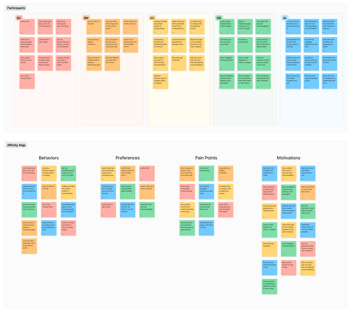
Based on the research, surge pricing is the most prevalent pain point, causing frustration among users, particularly during peak hours and events.
Based on the research, surge pricing is the most prevalent pain point, causing frustration among users, particularly during peak hours and events.
Ideation
Ideation
Ideation
How might we enhance price transparency for Uber riders by providing clear, real-time pricing information during peak times to enable better-informed decisions regarding cost and convenience for riders?
How might we enhance price transparency for Uber riders by providing clear, real-time pricing information during peak times to enable better-informed decisions regarding cost and convenience for riders?
How might we enhance price transparency for Uber riders by providing clear, real-time pricing information during peak times to enable better-informed decisions regarding cost and convenience for riders?
I then crafted user journey to capture the pain points and motivations of my target audience.
I then crafted user journey to capture the pain points and motivations of my target audience.
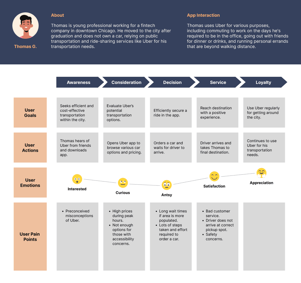
Based on these insights, I decided to create a Heat Map feature that provides real-time visibility into areas experiencing heightened activity levels.
Based on these insights, I decided to create a Heat Map feature that provides real-time visibility into areas experiencing heightened activity levels.
This feature aims to help users better understand the demand landscape, enabling them to anticipate surge pricing and plan their rides more effectively. By integrating this tool into the app, users can make more informed decisions, potentially avoiding peak pricing and reducing frustration associated with unexpected costs and delays.
This feature aims to help users better understand the demand landscape, enabling them to anticipate surge pricing and plan their rides more effectively. By integrating this tool into the app, users can make more informed decisions, potentially avoiding peak pricing and reducing frustration associated with unexpected costs and delays.
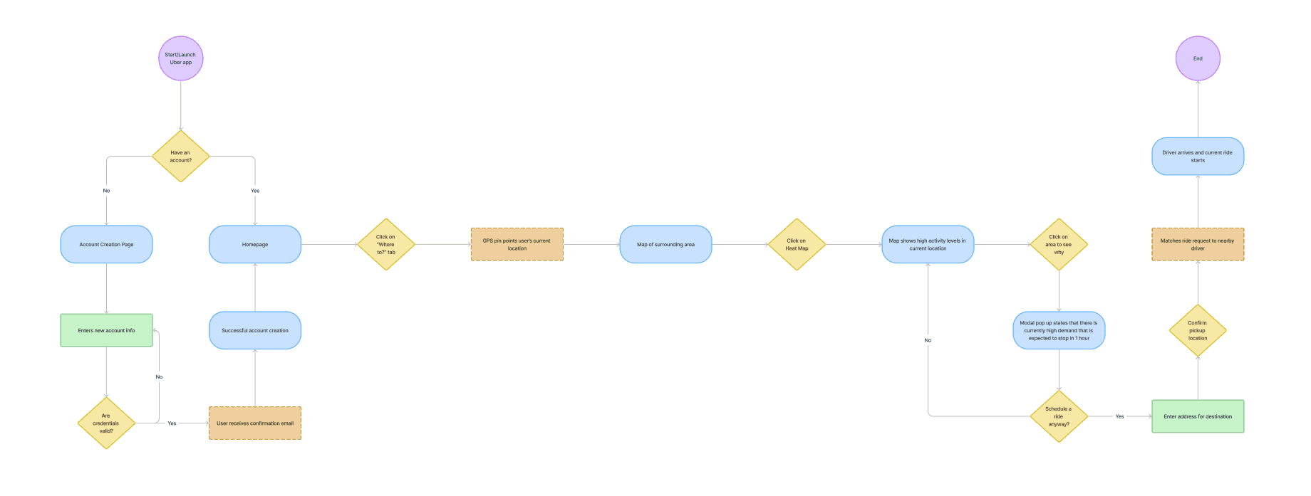
To help me organize the process that users might follow while navigating the app, I crafted a user flow.
UI Design
UI Design
UI Design
Low-Fidelity Wireframes
Low-Fidelity Wireframes
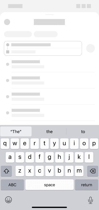
I began sketching out the basic structure of my feature in a few low-fidelity screens to establish a blueprint for my final design.
I began sketching out the basic structure of my feature in a few low-fidelity screens to establish a blueprint for my final design.




High-Fidelity Wireframes
High-Fidelity Wireframes
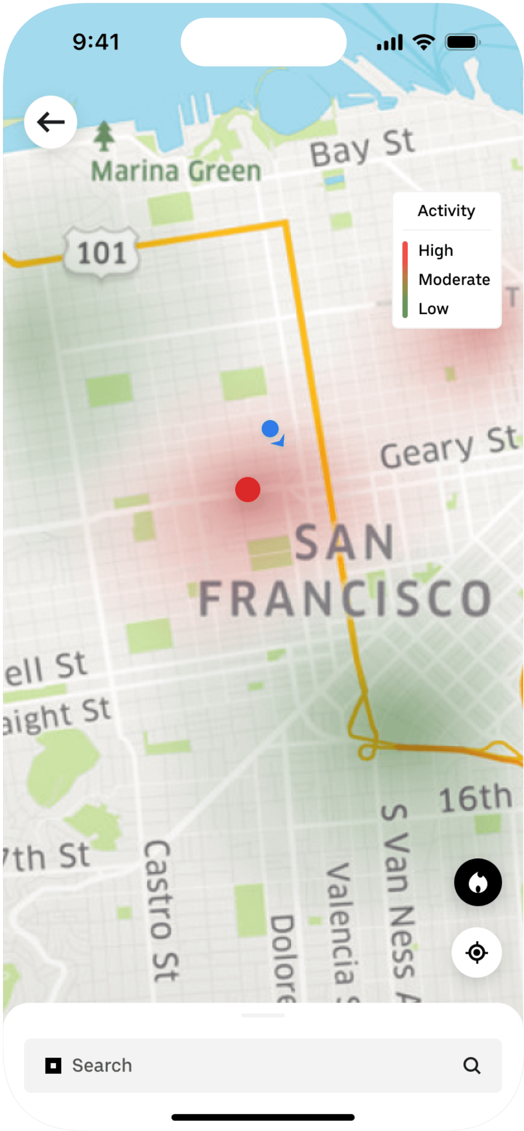
Following several iterations of the low-fidelity wireframes, I transitioned to designing the high-fidelity wireframes. In this phase, I added a Heat Map button to the Default Map screen and introduced an option for users to receive notifications when activity levels start returning to normal.
Following several iterations of the low-fidelity wireframes, I transitioned to designing the high-fidelity wireframes. In this phase, I added a Heat Map button to the Default Map screen and introduced an option for users to receive notifications when activity levels start returning to normal.






Prototyping & Testing
Prototyping & Testing
Prototyping & Testing
I then conducted various usability tests where I asked the participants to perform a series of tasks with the goals of:
I then conducted various usability tests where I asked the participants to perform a series of tasks with the goals of:
01.
01.
01.
Assessing the overall usability and effectiveness of the app.
Assessing the overall usability and effectiveness of the app.
02.
02.
02.
Identifying any navigation, usability issues, or any points of friction that may hinder user experience.
Identifying any navigation, usability issues, or any points of friction that may hinder user experience.
03.
03.
03.
Evaluating if the visual design interface, content organization, and layout are intuitive.
Evaluating if the visual design interface, content organization, and layout are intuitive.
04.
04.
04.
Gathering user feedback on their satisfaction of using the app to make iterations.
Gathering user feedback on their satisfaction of using the app to make iterations.
The participants were representative of the target audience/persona: those who currently use or have used ride-sharing apps. They were asked to perform a series of tasks and provide feedback on their experience.
The participants were representative of the target audience/persona: those who currently use or have used ride-sharing apps. They were asked to perform a series of tasks and provide feedback on their experience.
These tests were performed via moderated in-person sessions as well as moderated sessions via Zoom.
These tests were performed via moderated in-person sessions as well as moderated sessions via Zoom.
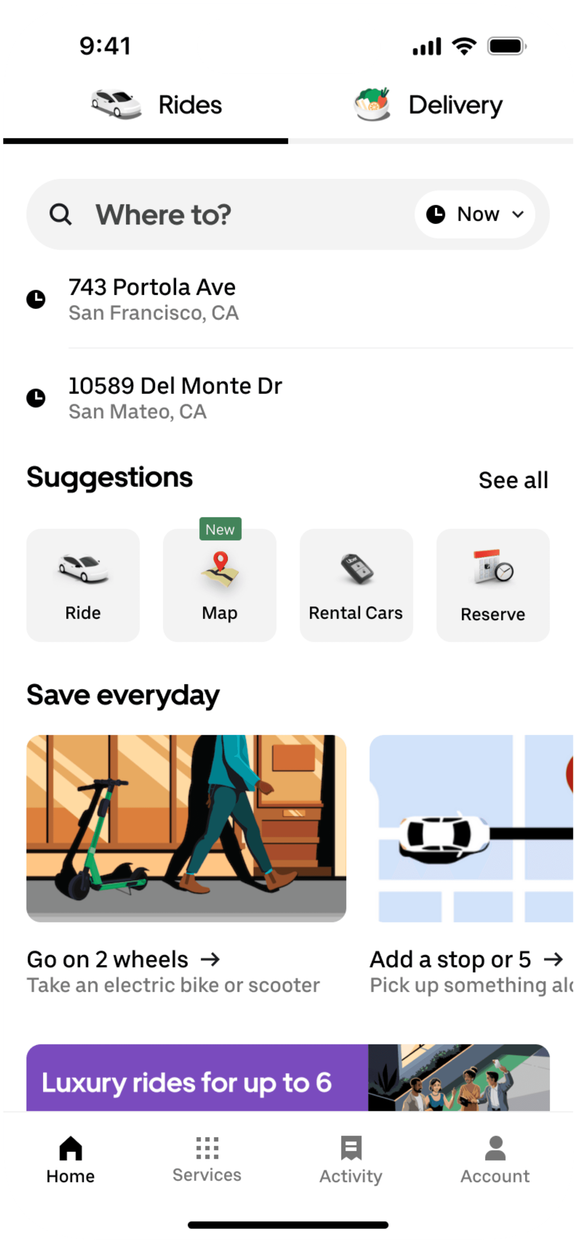
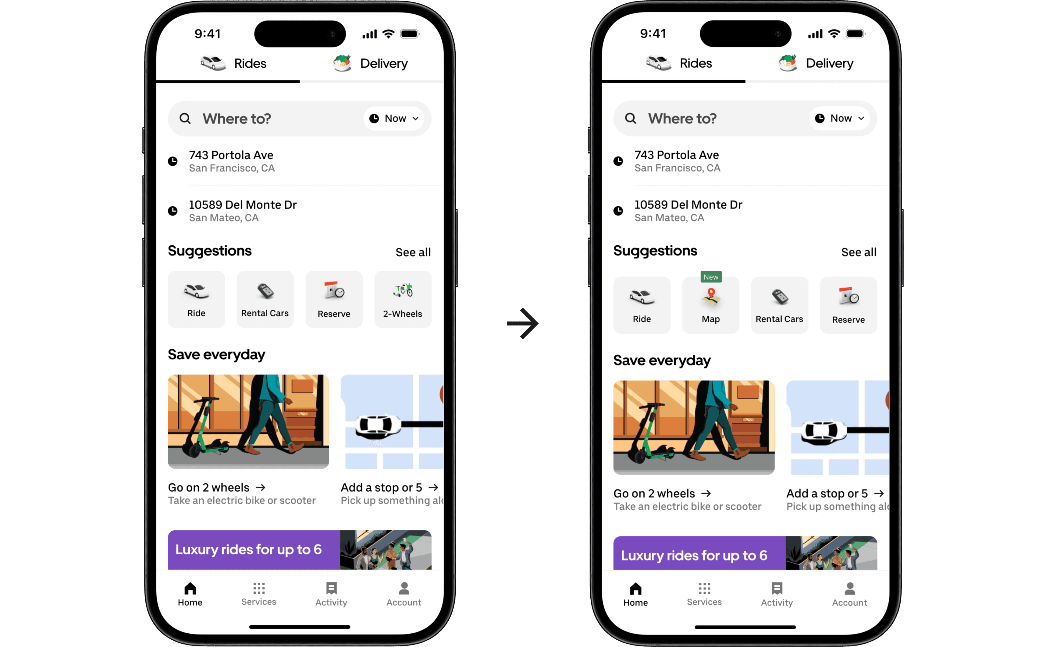
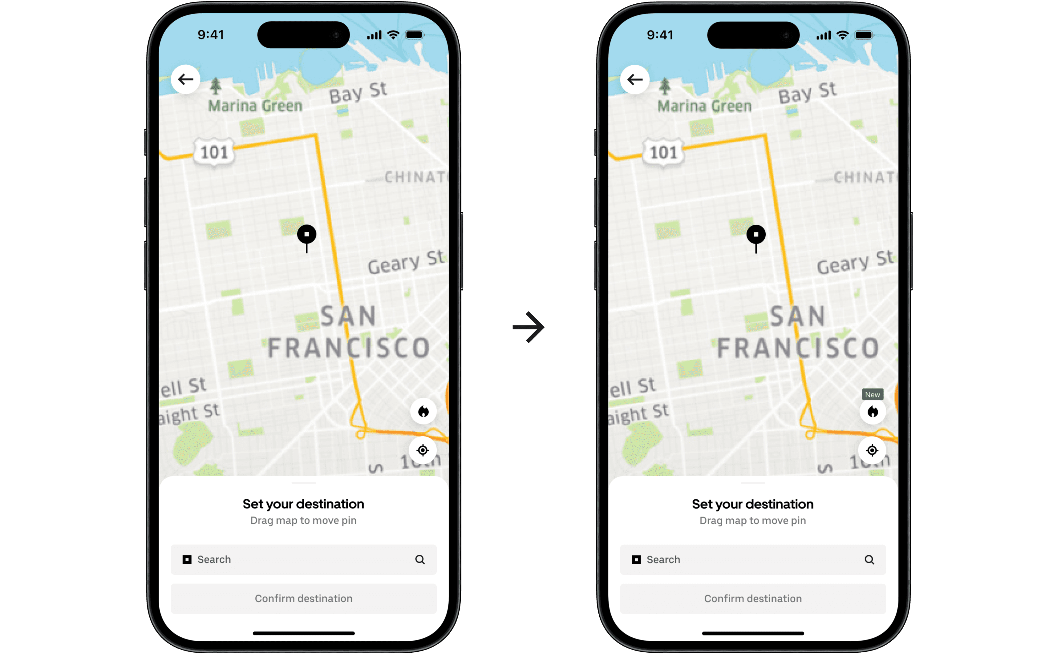
Participants from the usability tests had the most trouble with navigating to the Map from the Homepage so I added a “Map” button on the Homepage that directly leads to the map view. I also added a "New" banner on the buttons to draw the user's eye to the new feature.
Takeaway
Takeaway
This project provided valuable insights into the complexities of user experiences with ride-sharing apps, particularly regarding pricing and demand transparency. Developing the Heat Map feature was a strategic response to users' needs for more predictability and control during peak times. By addressing the prevalent pain points of surge pricing and inaccurate wait times, this feature empowers users to make informed decisions, thereby enhancing overall satisfaction.
This project provided valuable insights into the complexities of user experiences with ride-sharing apps, particularly regarding pricing and demand transparency. Developing the Heat Map feature was a strategic response to users' needs for more predictability and control during peak times. By addressing the prevalent pain points of surge pricing and inaccurate wait times, this feature empowers users to make informed decisions, thereby enhancing overall satisfaction.
Through my extensive research for this project, I learned that truly understanding users' frustrations and motivations can lead to a solution that not only mitigates pain points but also adds meaningful value to their interactions with the app.
Through my extensive research for this project, I learned that truly understanding users' frustrations and motivations can lead to a solution that not only mitigates pain points but also adds meaningful value to their interactions with the app.
